Input Dialog
InputDialog
lib.inputDialog(heading, rows, options)
exports['prism_uipack']:InputDialog(heading, rows, options)- heading:
string - rows:
string[]ortable(array)
- type:
'input'or'number'or'checkbox'or'select'or'slider'or'color'or'multi-select'or'date'or'date-range'
- options?:
table(object)
- allowCancel:
boolean
- If false the user will not be able to cancel and close the input dialog until submitted.
- If not defined, the user is able to cancel and close the input dialog.
Field Type Properties
- input
- label:
string- description?:
string- placeholder?:
string- icon?:
string- required?:
boolean- disabled?:
boolean- default?:
string- password?:
boolean- min?:
number- max?:
number
- number
- label:
string- description?:
string- placeholder?:
string- icon?:
string- required?:
boolean- disabled?:
boolean- default?:
number- min?:
number- max?:
number- precision?:
number- step?:
number
- checkbox
- label:
string- checked?:
boolean- disabled?:
boolean- required?:
boolean
- select and multi-select
- label:
string- options:
table(array)
- value:
string- label:
string
- description?:
string- placeholder?:
string- icon?:
string- required?:
boolean- disabled?:
boolean- default?:
string|table(only formulti-select)value of the default option
- clearable?:
boolean- searchable?:
boolean- maxSelectedValues?:
number(only formulti-select)Maxmimum number of options that can be selected.
- slider
- label:
string- placeholder?:
string- icon?:
string- required?:
boolean- disabled?:
boolean- default?:
number- min?:
number- max?:
number- step?:
number
- color
- label:
string- description?:
string- placeholder?:
string- icon?:
string- required?:
boolean- disabled?:
boolean- default?:
string- format?:
'hex'|'rgb'
- date
- label:
string- description?:
string- icon?:
string- required?:
boolean- disabled?:
boolean- default?:
stringortrueTrue defaults to current date
- format?:
stringDate format to display in the field
- returnString?:
booleanReturns the date as a string, default format is
DD/MM/YYYY, but if format is defined it will use that.
- clearable?:
boolean- min?:
string“01/01/2000”
- max?:
string“12/12/2023”
- date-range
- label:
string- description?:
string- icon?:
string- required?:
boolean- disabled?:
boolean- default?:
[string, string]- format?:
stringDate format to display in the field
- returnString?:
booleanReturns the date as a string, default format is
DD/MM/YYYY, but ifformatis defined it will use that.
- clearable?:
boolean
The callback data is promise based meaning that the thread will not continue executing until the user either sends the data or exits the popup.
The data returned will be a table (array), indexes represent the rows sent to the dialog, so if we want data from the first field that would be index 1 (0), if we want data from the third field, that would be index 3 (2), etc…
Field types such as date, date-range return a unix timestamp on the set value.
CloseInputDialog
Force closes the active input dialog and sets its return data as nil.
lib.closeInputDialog()
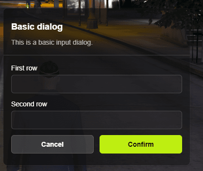
exports['prism_uipack']:CloseInputDialog()Basic Example
ox_lib
local input = lib.inputDialog('Basic dialog', {'First row', 'Second row'})

if not input then return end
print(json.encode(input), input[1], input[2])
Exports
local input = exports['prism_uipack']:InputDialog('Basic dialog', {'First row', 'Second row'})

if not input then return end
print(json.encode(input), input[1], input[2])
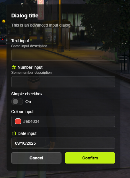
Advanced Example
ox_lib
local input = lib.inputDialog('Dialog title', {
  {type = 'input', label = 'Text input', description = 'Some input description', required = true, min = 4, max = 16},
  {type = 'number', label = 'Number input', description = 'Some number description', icon = 'hashtag'},
  {type = 'checkbox', label = 'Simple checkbox'},
  {type = 'color', label = 'Colour input', default = '#eb4034'},
  {type = 'date', label = 'Date input', icon = {'far', 'calendar'}, default = true, format = "DD/MM/YYYY"}
})

print(json.encode(input))

-- Getting rgb values from colour picker
local rgb = lib.math.torgba(input[4])

-- Transforming date timestamp to a readable format with Lua's os library (server-only)
local timestamp = math.floor(input[5] / 1000)
local date = os.date('%Y-%m-%d %H:%M:%S', timestamp)
Exports
local input = exports['prism_uipack']:InputDialog('Dialog title', {
  {type = 'input', label = 'Text input', description = 'Some input description', required = true, min = 4, max = 16},
  {type = 'number', label = 'Number input', description = 'Some number description', icon = 'hashtag'},
  {type = 'checkbox', label = 'Simple checkbox'},
  {type = 'color', label = 'Colour input', default = '#eb4034'},
  {type = 'date', label = 'Date input', icon = 'calendar', default = true, format = "DD/MM/YYYY"}
})

print(json.encode(input))

-- Getting rgb values from colour picker (requires importing ox_lib)
local rgb = lib.math.torgba(input[4])

-- Transforming date timestamp to a readable format with Lua's os library (server-only)
local timestamp = math.floor(input[5] / 1000)
local date = os.date('%Y-%m-%d %H:%M:%S', timestamp)